Her Best Asset is Getting a Good Nip & Tuck


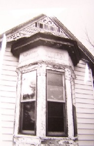
Hopefully, these pictures speak for themselves. The bay window's paint job is in the process of being upgraded to the non-zombie 3.0 version. Even though most of the "Clear Corona" or orange still needs to be finished, but it's looking a lot better in my opinion.
And, please excuse the fact that our brick walk is in desperate need of a mowing.
Labels: bay window, paint, progress, window


6 Comments:
I like it! The contrast is great. Just have to show off that detail.
Beautiful! I really like the colors. I was hoping to find architectural detail like that under the shingles on my house, but alas I have a folkie.
So lovely. Didn't notice the walkway... was too busy drooling over the house!
Thanks everyone!
Great progress. Don't know if you've seen this site, but there's a great article on the history of Queen Anne's -- which you probably already know -- and some cool pictures that might give you inspiration!
http://www.oldhouseweb.com/stories/Detailed/10292.shtml
Allison,
No, I hadn't seen that. Good article, it had some information that I hadn't heard before, so thank you. I think the Devil Queen fits somewhere between a "real" Queen Anne and a Queen Anne Farmhouse. She's not fancy enough for the first but too fancy for the later.
Post a Comment
<< Home