Marble Tiles and Trim
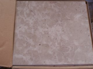
We'd love to have a counter top like Greg's, but we've had to settle for the next best thing, marble tiles. These tiles are a 12" x 12" so we'll have a lot more tile than grout.
 The white tile looks way too bright in this photo. It looks a lot better in person. It'll match all the white trim & base boards when everything is finished.
 The white tile looks way too bright in this photo. It looks a lot better in person. It'll match all the white trim & base boards when everything is finished.
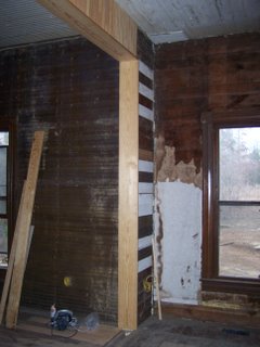
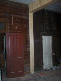
 Kenny has been working on the threshold between the dining room and living room. Originally there was a wall here. The previous owners tore the wall out, did a piss poor job of patching the hole, and then laid carpet over it. Kenny tore out their work and is replacing it with something nicer.


3 Comments:
I thought about the same thing with the 12" marble tile. The sides aren't finished though. I thought about adding a wood trim on the sides, but I wasn't sure how it would look. I asked around though, and found out that you can can buff the sides to be as smooth as the face with a high grit sandpaper.
they usually come in styrofoan "boxes" with 5 tiles in each box. If you use a rotary sander thingy, you can open the box and (leaving them in there) buff all 5 at the same time.
Good luck. Take lots of pics!
Hey, you are doing the white tile on the backsplash? Are the walls staying purple beadboard? My advice would be to do a seamless counter material that is cheap-o and inoffensive (like grey formica- gasp!) until you can afford the marble in the form you want- it makes a huge difference with the details like the edges they can put on and the sink details. Some of those marble tile counter jobs can look really bad and distract you from the rest of the kitchen.
Carol
Ninja,
The idea for the tile counter top came from my mother-in-law's house. She has wood trim for the edges and it looks pretty good. She used little 1 inch tiles though, and I wouldn't recommend that. They are hard to clean and they don't look as good as larger tiles.
Carol,
Thanks for the advice/warning. I went up and looked at the kitchen again after the post and compared it to the pics. The photo didn't look nearly as good as it does in real life (the white's too white, the purple is too blue, and the tile is too washed out). Also, two of the walls are sand colored, so that balances out the purple.
I've seen all sorts of tile counters (used to do appraisals, I've snooped in lots of homes) and I've seen lots of bad and good tile work. The key I think is a good pattern and good instalation. We're hoping that it'll all come together once everything is in place.
Thanks for the comments!
- John
Post a Comment
<< Home