We Are Not Amused
Or, are we?
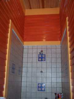
It occurred to me this morning that there is not one other Victorian house on Houseblogs that has a bathroom that looks anything like this (that I've seen, correct me if I'm wrong).

Take a look around if you haven't already. Here we have some period Victorian bathrooms complements of Greg at Petch House; here are some Greg's musings on bathroom tiles and old toilets; here we have Mindy picking a color scheme for their bathroom at Fixer-Upper; here is Steve and Jocelyn's Chicago 2-Flat rental (I guess technically a 2-Flat isn't a Victorian, but it's not that far off time wise). What do you see? I see lots of classic, classy traditional bathrooms. Subway tiles, immaculate wood work, wainscoting, and more. There is no shortage of beauty here.
So, looking at my bathroom with its two oranges, the ultramarine floor tiles, and sandy colored tiled shower I try to image what this room might look like to a someone with more period appropriate sensibilities might make of it. I'm guessing a clown car maybe? And, I'm not sure why, but I find that possibility quite funny.
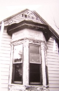
So, what gives? Why did I spend over $5000 for custom milled exterior siding to preserve the Devil Queen's historic appearance and then turn around a make a bathroom that looks so modern?
1) This bathroom was not original to the house. Somewhere around 1950 they partitioned off a portion of the front parlor to make room for this bathroom. In case you're wondering, it was hideous.
2) Once we stripped out all of the fake wood paneling, the drop ceiling, the floating chimney, and all the other crap, all we had left was sub-par framing and butchered wall boards & ceiling. There wasn't anything to restore (unless we demolished the whole thing and returned it to the parlor).
3) We were completely broke, so we had to use what we could afford or what was available.
That said, it still doesn't account for our color selection. I say "our," but I really mean Scarlet. For all the weird shit that I do and display here, I'm a fairly reserved person most of the time. Dull. Stuffy. Boring. While I haven't quite joined the "I see window treatments" club (yet), I do have actual opinions on color schemes, decorating, et cetera. They tend to be safe, understated choices. However, over time I've succumbed to Scarlet's way of seeing things, and Scarlet is nothing if not flamboyant. I know, "succumbed" makes it sound like I died of a disease, but don't be fooled. I actually like living outside of my chromatic comfort zone. And, I've come a long way over the years. I nearly died when she told me she wanted to paint two kitchen walls purple.
At this point, I will pretty well use any color scheme she selects (thought I did rebel when she suggested that I paint the laundry room's window trim four different colors). She picked orange, so I painted it orange. And, I liked it. In this windowless room, the bright colors make me happy. And hungry (the trim looks but does not taste like orange sherbet).
I was pretty pleased with it and was excited to show off my handy work to Scarlet. She took one look at it and her eyes popped out of her head.
"OH MY GOD. I knew it was orange, but that is really ORANGE."
My son rounds the corner, stops, and points at the wall. "Wow. Orange." Pointing at the trim, "Momma, Orange!"
"Yes Giddy, that is definitely orange." Scarlet turns to me, "Do you like it?"
I heard the panic creeping into her voice.
"Yes."
I'll admit it. I suffered a moment of doubt, but I still like it. And, as it turns out, Scarlet (after living with it a little) and Gideon do too. However, the real test was Christmas, but that will have to be another post.
It occurred to me this morning that there is not one other Victorian house on Houseblogs that has a bathroom that looks anything like this (that I've seen, correct me if I'm wrong).

Take a look around if you haven't already. Here we have some period Victorian bathrooms complements of Greg at Petch House; here are some Greg's musings on bathroom tiles and old toilets; here we have Mindy picking a color scheme for their bathroom at Fixer-Upper; here is Steve and Jocelyn's Chicago 2-Flat rental (I guess technically a 2-Flat isn't a Victorian, but it's not that far off time wise). What do you see? I see lots of classic, classy traditional bathrooms. Subway tiles, immaculate wood work, wainscoting, and more. There is no shortage of beauty here.
So, looking at my bathroom with its two oranges, the ultramarine floor tiles, and sandy colored tiled shower I try to image what this room might look like to a someone with more period appropriate sensibilities might make of it. I'm guessing a clown car maybe? And, I'm not sure why, but I find that possibility quite funny.
So, what gives? Why did I spend over $5000 for custom milled exterior siding to preserve the Devil Queen's historic appearance and then turn around a make a bathroom that looks so modern?
1) This bathroom was not original to the house. Somewhere around 1950 they partitioned off a portion of the front parlor to make room for this bathroom. In case you're wondering, it was hideous.
2) Once we stripped out all of the fake wood paneling, the drop ceiling, the floating chimney, and all the other crap, all we had left was sub-par framing and butchered wall boards & ceiling. There wasn't anything to restore (unless we demolished the whole thing and returned it to the parlor).
3) We were completely broke, so we had to use what we could afford or what was available.
That said, it still doesn't account for our color selection. I say "our," but I really mean Scarlet. For all the weird shit that I do and display here, I'm a fairly reserved person most of the time. Dull. Stuffy. Boring. While I haven't quite joined the "I see window treatments" club (yet), I do have actual opinions on color schemes, decorating, et cetera. They tend to be safe, understated choices. However, over time I've succumbed to Scarlet's way of seeing things, and Scarlet is nothing if not flamboyant. I know, "succumbed" makes it sound like I died of a disease, but don't be fooled. I actually like living outside of my chromatic comfort zone. And, I've come a long way over the years. I nearly died when she told me she wanted to paint two kitchen walls purple.
At this point, I will pretty well use any color scheme she selects (thought I did rebel when she suggested that I paint the laundry room's window trim four different colors). She picked orange, so I painted it orange. And, I liked it. In this windowless room, the bright colors make me happy. And hungry (the trim looks but does not taste like orange sherbet).
I was pretty pleased with it and was excited to show off my handy work to Scarlet. She took one look at it and her eyes popped out of her head.
"OH MY GOD. I knew it was orange, but that is really ORANGE."
My son rounds the corner, stops, and points at the wall. "Wow. Orange." Pointing at the trim, "Momma, Orange!"
"Yes Giddy, that is definitely orange." Scarlet turns to me, "Do you like it?"
I heard the panic creeping into her voice.
"Yes."
I'll admit it. I suffered a moment of doubt, but I still like it. And, as it turns out, Scarlet (after living with it a little) and Gideon do too. However, the real test was Christmas, but that will have to be another post.


12 Comments:
My view is you have to live with it, so you might as well have it as you'd like it. Which is why we have what some might argue is a touch of an african theme running throughout a house in the middle of the frozen prairies in Canada.
I like your bathroom - it's a small space and the bright colours are cheery, even if orange and blue are complementary colours. What I really, really like though are those inset blue tiles with the flowers. I may just have to copy you there.
Chris,
You couldn't be more right about it.
We painted our last house with neutral colors because we were hoping to sell it. We thought it would make it more desirable. As it turned out, we ended up living there for three or four years and we hated it. After that, we swore no mater where we lived that we would do it our way.
Oh, and thanks!
We like those tiles too. We bought them off the clearance rack at Lowe's ($65 in tiles for $5) and just gave them to the tile guy with the instructions to "do something with them." We couldn't be more pleased.
Paint can always be changed. The tiles you chose are VERY nice, and they can be the base of many different color schemes in that room.
Of all the details to worry about, paint is the least. Show your colors!
Okay, so it isn't period appropriate, but it's definitely a unique space and by using bold colors, you are working with that rather than trying to vanilla out the space. We have alot of color in our place (red, mustard yellow, green) just not in the bathroom.
The space reminds me of when people do powder rooms up big time. Kind of like a surprise room.
Picking colors is my least favorite part of the process, so be glad you have someone that enjoys it. I came close to doing a 1920s/30s bathroom, but I succumbed to....something, I'm not sure what, and decided to do a period 1895 bathroom. Your way is much more affordable, that's for sure. This bathroom is going to put me in the poor house. If I fail to pull off an authentic 1895 bathroom, one things for sure, it will be a spectacular failure.
I like bright colors in a small space. They'd be overpowering in a big room, right? I think the bathroom is one place you can have a lot of fun with color.
Well, you don't have room for a sitz bath anyway. If you want to edge down that slippery slope just a bit, tell everyone you've painted your bathroom not orange, but Persimmon.
By the way John, the club meets on Tuesday and Thursday evenings at 6. If you could bring a potato salad or maybe a small plate of sandwiches that'd be great. Club dues: $6 payable to my account.
And bring paint chips.
I really like your bathroom colors. They pop! And they make me smile.
Enjoy!
As the owner of a folk Victorian I echoed your reasonings when it came to the bathroom. Welcome to my blooming aster (blue violet) bathroom complete with glass tiles. I inadvertently duplicated a tile pattern found in other bathrooms in town, mine are just on the shower wall as opposed to the floor. Do what makes you happy--that you can afford anyway.
Amanda
Thanks everyone!
Greg, I wouldn't worry too much about your bathroom. If looks anywhere nearly as good as your kitchen, it'll look fabulous.
David, I was thinking "Spiced Pumkin."
Chris, have we slid far enough yet for a quiesh?
Post a Comment
<< Home